Canopy Design System, Tokens & Components Kit
Stop rebuilding the same buttons, cards, and color scales on every project. Canopy gives you a complete, production-tested design system you can drop in today and ship faster tomorrow. What you get out of it What’s inside How it fits into your workflow Drop tokens.css into
Stop rebuilding the same buttons, cards, and color scales on every project. Canopy gives you a complete, production-tested design system you can drop in today and ship faster tomorrow.
What you get out of it
- Ship websites faster — skip the blank-file phase and start from proven tokens, components, and page sections
- Look professional instantly — every color, type scale, and spacing value is already balanced and consistent
- Stop guessing — clear usage guidelines tell you when to use each token and component
- Stay consistent across projects — one token file keeps your work visually unified as it scales
- Learn from a real system — study how a production website is actually structured, not a toy demo
What’s inside
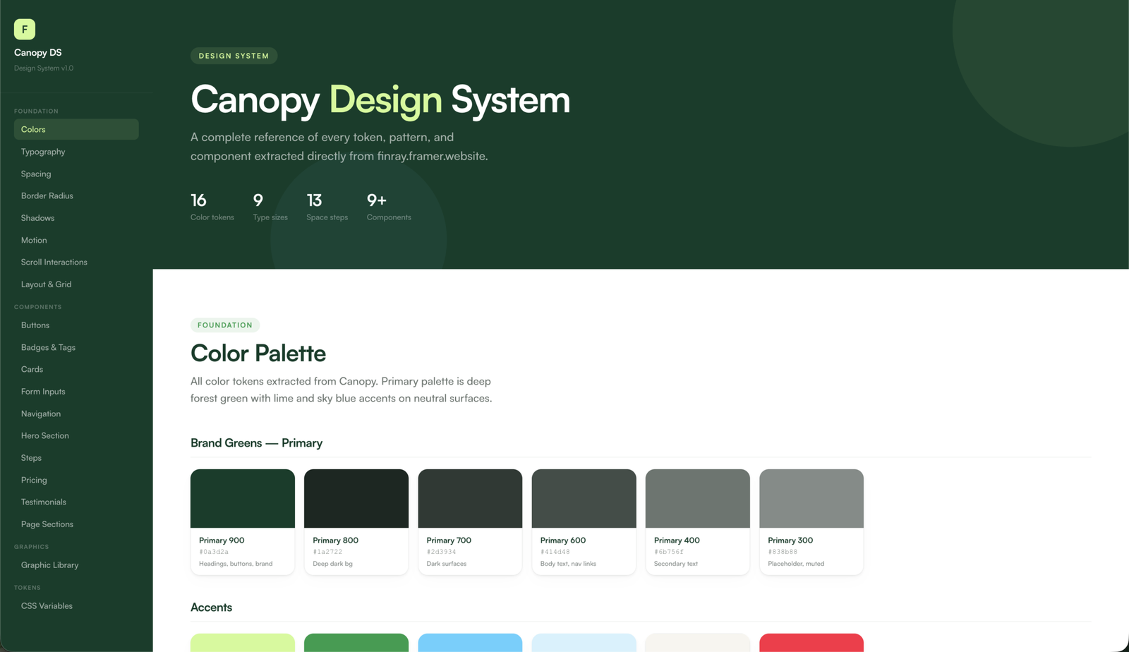
- Foundation tokens: colors, typography (9-step scale), spacing (13-step scale), border radius, shadows, motion, layout, and scroll patterns
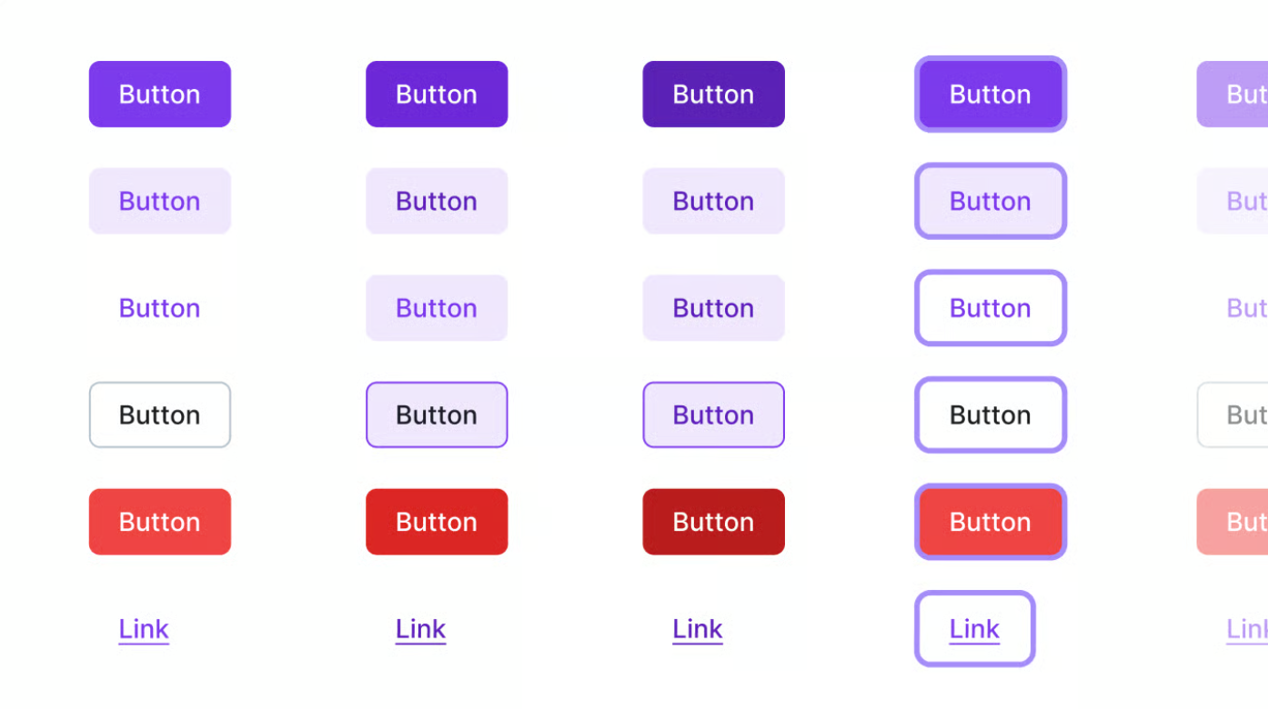
- Components: buttons (5 variants × 4 sizes), cards, badges & tags, form inputs in every state, and navigation
- 10 full page-section patterns: hero, features, pricing, testimonials, CTA, footer, and more
- Graphics: feature compositions, floating UI cards, decorative elements, and an icon box system — pure CSS/SVG, no image assets to manage

How it fits into your workflow
Drop tokens.css into any project and reference tokens by name in your own CSS. Works with any stack — no framework lock-in, no build step required. A full visual reference doc shows every token and component at a glance.
Who it’s for
Freelancers, indie developers, and designers who want to launch client sites and personal projects faster without sacrificing quality — and who’d rather build on a real, production-quality foundation than start from scratch.
FAQ
Does this work with React, Vue, Next.js, or my framework of choice?
Yes. Canopy is pure CSS custom properties and plain HTML/CSS components, so it drops into any framework or static site with zero configuration. No build step, no dependencies.
Do I need Tailwind, Sass, or a build tool?
No. Everything runs on native CSS variables. If you already use Tailwind or Sass, you can still reference the tokens alongside them.
Can I use this for client projects?
Yes. You can use Canopy in unlimited personal and commercial projects, including paid client work. You cannot resell or redistribute the kit itself as a template or design system.
Is this a Figma file?
No. Canopy is code — CSS tokens, HTML component markup, and a visual reference doc. It’s built for developers and designers who ship in the browser.
Will I get updates?
Yes. Any future updates to the kit are free for existing customers — you’ll get them at the same download link.
What if it’s not right for me?
Refunds are available per the store’s refund policy. Just reach out.